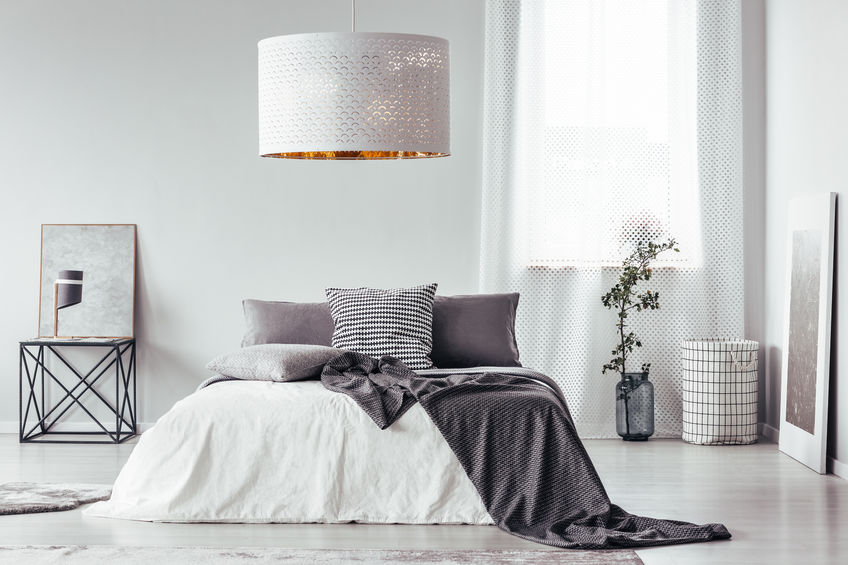
Texture is one of seven key components that interior designers facilitate when designing a space. In fact, you will find that every design should incorporate all seven elements consisting of balance, lines, forms, colors, lighting, patterns, and textures. Many of these can easily be accomplished with a little consideration and preplanning. However, many people struggle with understanding and properly using texture.
Texture can be split into two categories: tactile and visual. Both serve equal importance. A good design theme incorporates more than just visual aesthetics. In fact, texture is the interactive experience a room has to offer. For instance, have you ever been inside of a beautiful room, yet the chairs were uncomfortable? This negative experience can be affiliated with a lack of proper use of texture.
Texture caters to more than just our visual senses, but it also gives to our sense of touch. In fact, design themes should incorporate a good experience for all senses. Just like a room that smells bad can be a bad experience, a place that does not serve texture justice can really ruin a design theme completely. However, do not fear! Mastering texture can be super easy and added to any room, even if you have yet to consider it! Plus, chances are you already have texture in your room. Here is how you can master both tactile and visual texture:
Tactile
Tactile is connected to your sense of touch. These textures are the textures that you come into contact with every day. Having a plethora of textures can enhance your atmosphere, but this is not just done through comfort but diversity. So make sure to include comfortable throw pillows, rugs, or soft elements to create an atmosphere that feels more inviting. You can also use hard textures like granite countertops, glass end tables, or hardwoods to help ground stability. Using rough and smooth textures or grainy and silky will create textural contrast. This step is essential when designing your space.
Visual
However, texture goes beyond what you can touch. Stucco walls or visually grainy textures will also create contrast. This feature is essential when monochromatic elements meet. If you have a white rug lying on top of a white rug, there will be no visual contrast. Instead, this is why we would put a white rug on top of white hardwood floors. While the colors are the same, the visual texture contrast creates depth. In essence, texture is vital when using a monochromatic theme to create separation or depth in an atmosphere. However, it is still very essential in the atmosphere flourishing with color to help make a more rounded and well-balanced design theme.
Texture can be a tricky element to consider putting in your design. Try to step back and look at each room individually. Does it lack stability or comfort? Is there no visual contrast between similar colors? If not, your room is most likely missing texture. Try incorporating some of these tricks to help bring your design theme to the next level and create balance.

Leave a Reply